
 |
 |
 |
 |
 |
 |
“I only know how to make tofu. . . ."
Exclusively available to purchase at Paul Smith.
Ozu Tofu presents six servings of vanilla; as alternate cuts of cinematic environments - freeze frames, drawn from a moving object. More specifically, they each rework a single frame extracted from An Autumn Afternoon (Sanma no aji, 1962), the masterful epilogue created by one of the world’s most influential cinematic directors - Yasujirō Ozu (12 December 1903 – 12 December 1963).
Venerated for his seemingly economic approach to storytelling, both in terms of visual composition and narrative, exploration of Ozu’s oeuvre reveals a much more complex, and profoundly nuanced presentation of life, captured in a rapidly changing Japan. This somewhat philosophical mise-en-scène he modestly hid within the suggestion that his movies were simply tofu; either fried, boiled or stuffed. Ozu argued that he was fashioning movies which were unfancy, and ostensibly everyday. To that end, this humanistic approach categorises his pictures as shōshimin-eiga - realist depictions of mainstream normality. Latterly, he also touched on social commentary, overlapping traditional themes with contemporary drama - a style known as Gendai-geki.
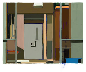
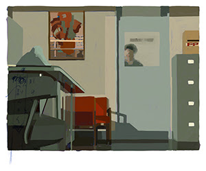
The sextet of compositions comprising Ozu Tofu extract some of the emblematic and distinctive punctuation points for which the director was known. His ‘pillow shots’ would counter traditional advancement of film narrative - cutting between active scenes with a more or less still image - sustained over a sufficient count of time to facilitate contemplation; both of a relative and more existential nature. These intermediate pause points were deliberately fashioned by Ozu, as a means to enter meditative silence, forcing the viewer into introspective deliberation. In addition, the poetic meaning, and obsessive attention to detail layered within his film work, suggested a strong association with the Japanese concept of mono no aware, which roughly translates as the ‘pathos of things’ - this the beauty of impermanence; celebrating the transient splendour of the ephemeral.
As a set of minimalistic works; apropos the Director’s specific modus - simple, visual poetry, built from deeper philosophical ideals - Ozu Tofu exists in a flattened, paired-down tableau of three-dimensional space. They juxtapose the Japanese auteur’s own framing approach - of spatial and social divides, frames within frames (to some extent emotional metaphors of the ubiquitous Shoji screens) - with a deference to the later, geometric compositions of Dutch artist Piet Mondrian, and the graphic depictions of urban architecture painted by American artist Ed Ruscha, where the banality of urban life becomes elevated into the art of the everyday. Furthermore, employment of complex grids featuring actors, and the evolving storyline, allude to the multi-paned cartoon infrastructure of Manga comics.
For Ozu, it was not only framing that he focussed on, but colour, and more specifically red. An Autumn Afternoon is one of the six colour films, that he shot, using German Agfacolor film stock. This he preferred over the more widely used Eastman Kodak, as it pushed reds into a prominent spectral depiction. Takashi Kawamata, the chief assistant cinematographer for Ozu’s later films, suggested the Director favoured the ‘half-asleep’ chroma of Agfacolor. With a variety of strategically-placed objects of bold, sanguine toning, Ozu’s colour obsession even found its way into the movie’s script, as states one of the artwork’s titles - Would you happen to have a couple of extra tomatoes?
Embracing a defined set of colour hues, Ozu Tofu pushes a largely muted palette, periodically punctured by bursts of deliberately-placed crimson. These six pauses in the life of the fictional Hirayama family are recalibrated using a contemporary brush, each overlayed with a spectral trace of Ozu’s hand-written script notation; an ethereal presence within each and every serving of tofu; where simplicity can evoke notions of complexity, and still can become moving. As a meditation on time and space, these works suggest a conscious interruption; an attempt to capture the beauty hidden within the everyday; where each work’s title is in itself a subtitle, extracted from its proximity to the point of suspension.
All artwork, text and imagery © James Straffon 2026.